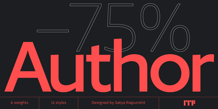
Author is a family of humanist sans serif fonts. They are optimized for use in modern publications – hence the the name ‘Author.’ Its letterforms are slightly expanded, which gives the counter-forms inside of them enough space to breathe, thus increasing their legibility and helps with their on-screen rendering, too. Author’s family includes six weights, ranging from Extralight through Bold. Each weight has an upright and an italic font on offer. The uppercase letters are virtually mono-linear in appearance; however, several of the lowercase letters have visible stroke contrast. The tops of Author’s strokes terminate in diagonal cuts; these are reminiscent of the broad-pen that would be used to write the humanist letterforms the typeface is based on. In Author’s upright fonts, the lowercase ‘a’ and ‘g’ are double-storied; there is a single-storey ‘g’ in the fonts as an OpenType alternate. In the italic fonts, the ‘a’ and the ‘g’ are both single-storied. The ascenders of Author’s lowercase letters a slightly taller than the tops of the capitals. The family’s fonts include both lining and old-style figures; in both versions, the ‘3’ has a flat top. Author was designed by Satya Rajpurohit, the founder of Indian Type Foundry.


No comments:
Post a Comment