Grotesques can answer a really wide variety of design problems and go from small sizes to large without missing a beat.
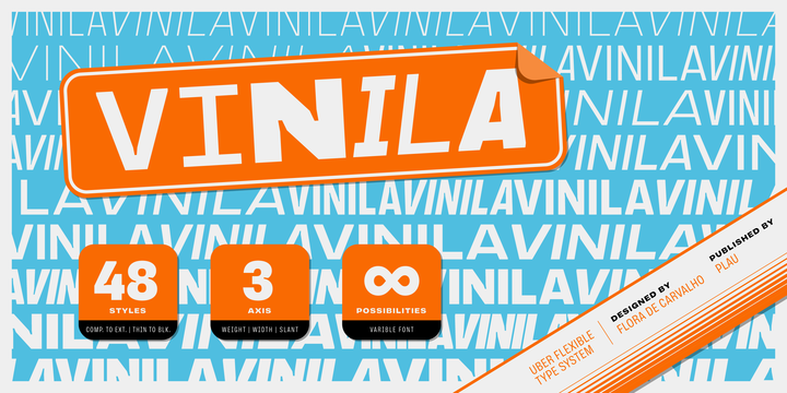
Vinila is Flora de Carvalho’s take on the genre. The family’s multi-purpose intention comes from having 4 widths - from compressed to extended, each with 6 weights and obliques.
Rhythm and music played an important part in the design of this font, which started off as the lettering for a Brazilian Music album.
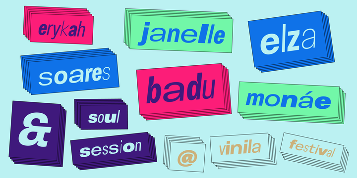
Its distinctiveness comes from having powerful ink traps that go from elegant and supple in the lighter styles to commanding and impactful in the heavier styles. A distinct rhythm is achieved, making it a strong face for editorial design, branding projects and so much more.
Vinila is the ideal companion to expressive display faces, where it serves a supporting role with a marked presence. We use Vinila every day in our own brand identity. We've had some of the best designers use it and test it in many different environments, printed, digital, mobile and more (they really like it!).
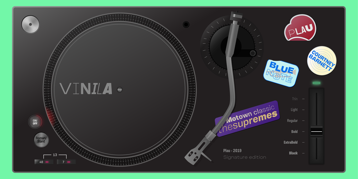
Also in the package, Vinila Variable is an experimental version of Vinila, where you can have a virtually infinite mix of weights, widths and slant, all from a single font file. Available when you license the complete family.
Vinila pairs happily with our cheerful Manteiga, elegantly with our organic didone Tenez and mechanically with our monospaced Odisseia. What other matches can you think of?


No comments:
Post a Comment