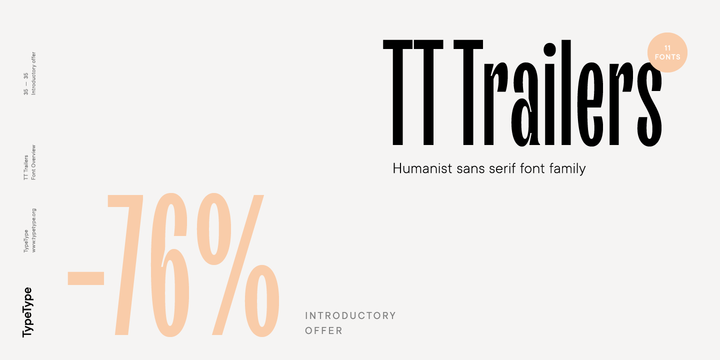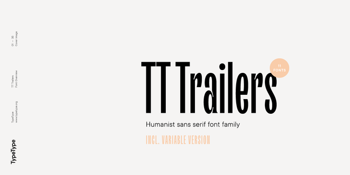
Buy the complete TT Trailers family and get the variable version for free.
The starting point of the TT Trailers project was the idea to develop a new generation of narrow typefaces for use in movie credits and posters. Our portfolio already had a modular geometric sans TT Bluescreens, so the new project from the very beginning was in a humanist spirit. In addition, we conducted a small study and found that there are not many modern narrow humanist grotesques on the market. TT Trailers is based on the concept of preserving the amount of white: when changing from thin to bold, the width of characters increases significantly, which ultimately allows you to save an equal amount of white inside and between letters.
The big challenge for us was the task of making the curves sufficiently smooth. The closed aperture of the characters also emphasizes the smoothness and plasticity of the letters and helps the typeface to maintain a consistent rhythm. In some letters, we designed flared diagonals and added massive compensators, which are designed to combat potential sticking. In addition, we quite actively used “loops” in the design of some letters, which, together with the contrast and humanist style give TT Trailers a slight retro touch and refer us to the cinema posters of the 60s.
We spent a lot of time working with the rhythm of the typeface, which was quite difficult because of its humanist character, especially in the Cyrillic segment. We have drawn contextual alternates for some Cyrillic pairs of characters that are designed to help preserve the rhythm of the typeface and to deal with possible holes in the set, which is especially important for this type of ultra-thin fonts. In addition, the design of some Cyrillic letters turned out to be a bit unusual, which is due to the functions embedded in them, but at the same time this is intended to emphasize the character and the spirit of the font family.
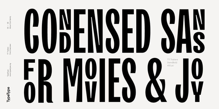
And now we will tell you a little more about the unique TT Trailers features. First, it is the TITL OpenType feature (titling alternates), which allows you to arrange the letters one above the other, while not going beyond the height of the uppercase character. So, all you have to do is choose an even number of characters and click on the TITL feature and the characters will be placed one above the other. Moreover, all the signs in this feature are monospaced, so they will always be located strictly one above the other.
Secondly, we made it possible to raise letters and numbers to lower or upper case. In both cases, the character will occupy half the height of the uppercase character and will perfectly match with blocks of double characters. In addition, you can include underscores in upper case characters. These features are great for use in movie titles and posters, or for layouts that require underlined notation for topographic units.
In total, the TT Trailers font family includes 11 fonts: this is the main typeface consisting of 9 styles, a variable version of the font, and 1 font with icons. The main styles consist of 1078 glyphs and have a broad language support (extended Latin, Cyrillic, Bulgarian locl., etc.). In addition, we drew a large number of ligatures and alternates (for Latin and Cyrillic), oldstyle figures and simply there are a lot of other useful features (ordn, case, c2sc, smcp, ccmp, frac, sinf, sups, numr, dnom, tnum, pnum , onum, lnum, liga, dlig, salt, ss01, ss02, ss03, ss04, ss05, ss06, ss07, ss08, titl, calt).
And be sure to try the variable version of TT Trailers, with which you can choose the individual thickness you need. The variable version of TT Trailers completely copies the composition and functionality of standard styles and allows you to use all the features. By the way, when you purchase the entire TT Trailers family, you will receive entirely free the variable version of the TT Trailers, TT Trailers Variable.


No comments:
Post a Comment