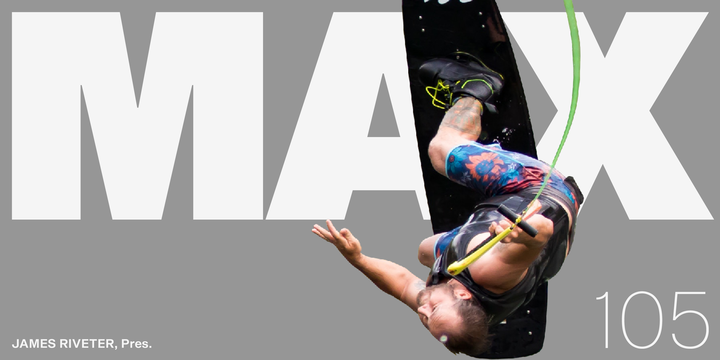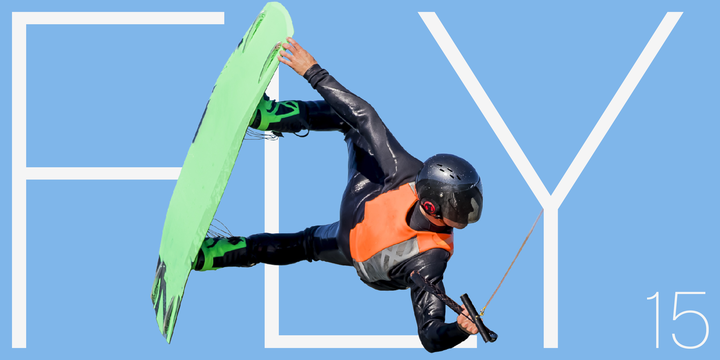
A neo-grotesque with 19 cuts from very light to very bold.
On the basis of the classical form, Shapiro meets all the requirements that are placed on a good font, such as good readability, a sympathetic overall impression, as well as a balanced gray-effect.
The very bold cuts are a good starting point for a branding.


No comments:
Post a Comment