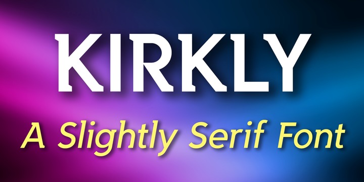
Kirkly - A Slightly Serif Font. Our first font release is an imaginative hybrid font family that is a mix between a sans serif and serif design. In all, it contains 68% fewer individual serifs than a traditional serif font. The result is a clean, stylish, humanistic design that conveys strength, movement and individuality.
I’m reminded of Art Webb’s famous design principle, “If everything is bold, then nothing is bold.”
“To me, serif fonts have always seemed to be overdone and garish. My goal in creating Kirkly was to remove as many serifs as possible, and still retain an elegant, tasteful, well-balanced serif typeface. I think I was successful in creating a new genre, and I intend to experiment with this concept in future font designs.” — Kirk
This distinctive, easy-to-read font family consists of 14 weights (including italics). It’s an Adobe Latin 3 Character Set containing 300 glyphs per style (including special characters). Kirkly works great in long form typesetting and headlines.


No comments:
Post a Comment