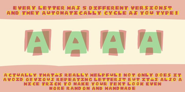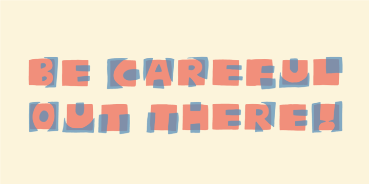
This is a font that will fit in the "hard to read section" because it may not be super legible at first sight - that is because of the negative space. But when you combine the two layers (Layer and Box) the letter suddenly appears very legible!
Play around with your favourite colour palette while adjusting the transparency in order for the colours to blend, giving a really nice handcrafted look!
You have 4 different versions of each letter to play around with and of course there is multilingual support!


No comments:
Post a Comment