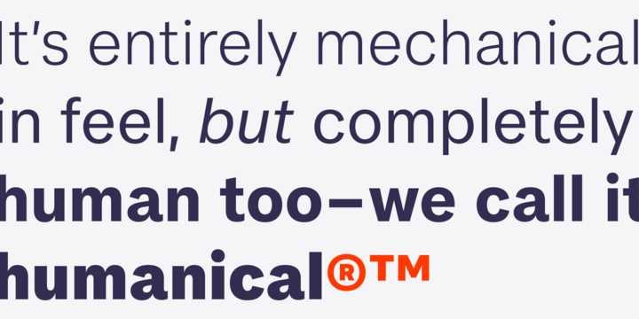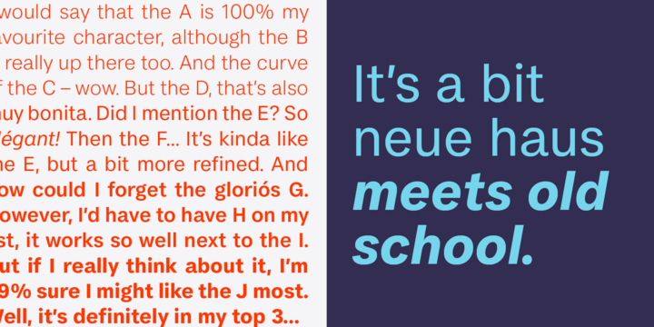
FS Koopman is a hard-working typeface.
A crossbred workhorse that draws on inspiration from Swiss grotesks, American gothics and early British grotesques. It refuses to fit neatly into any of these categories, it’s neither
one nor the other, but all of the above. It’s kinda Swiss meets American… (but with a slight Yorkshire twang).


No comments:
Post a Comment